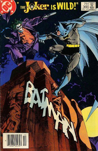
COVER STORY: Batman #366
DC Comics; 75¢
What makes the best comic book covers? It’s a great topic for debate. For us as individuals there is no wrong answer, of course. It’s purely subjective. But with a little thought, it is frequently possible to explain what it is about a particular image that grabs you. The best ones are the ones that make you stop and check out something you weren’t previously going to purchase – and in some cases, you even end up picking up a title you’ve never even heard of before.
One of the most clichéd phrases in the history of clichéd phrases is “It doesn’t get any better than this,” but seriously, it really doesn’t get much better than Walter Simonson’s cover for Batman #366.
Let’s take a quick look at what it has going for it:
Batman? Check.
The Joker? Check.
Crackling good amount of tension and energy? Check.
Simonson’s inventive design and subsequent execution of that design all work brilliantly. Seemingly captured mid-movement, Batman and the Joker look as if they’re really going at it, regardless of their precarious perches atop a towering edifice.
The action and setting combine well with the moon, the dark sky and billowing clouds to highlight the unique logo placement.
This really is one of those covers that make you stop and look. How could you not pick this one up?
– J.C. Vaughn

Popular Topics
Overstreet Access Quick Links
COVER STORY: Batman #366
DC Comics; 75¢
What makes the best comic book covers? It’s a great topic for debate. For us as individuals there is no wrong answer, of course. It’s purely subjective. But with a little thought, it is frequently possible to explain what it is about a particular image that grabs you. The best ones are the ones that make you stop and check out something you weren’t previously going to purchase – and in some cases, you even end up picking up a title you’ve never even heard of before.
One of the most clichéd phrases in the history of clichéd phrases is “It doesn’t get any better than this,” but seriously, it really doesn’t get much better than Walter Simonson’s cover for Batman #366.
Let’s take a quick look at what it has going for it:
Batman? Check.
The Joker? Check.
Crackling good amount of tension and energy? Check.
Simonson’s inventive design and subsequent execution of that design all work brilliantly. Seemingly captured mid-movement, Batman and the Joker look as if they’re really going at it, regardless of their precarious perches atop a towering edifice.
The action and setting combine well with the moon, the dark sky and billowing clouds to highlight the unique logo placement.
This really is one of those covers that make you stop and look. How could you not pick this one up?
– J.C. Vaughn
Popular Topics
Overstreet Access Quick Links