COVER STORY: X-O Manowar #5
What makes the best comic book covers? It's a great topic for debate. For us as individuals there is no wrong answer, of course. It's purely subjective. But with a little thought, it is frequently possible to explain what it is about a particular image that grabs you. The best ones are the ones that make you stop and check out something you weren't previously going to purchase – and in some cases, you even end up picking up a title you've never even heard of before.
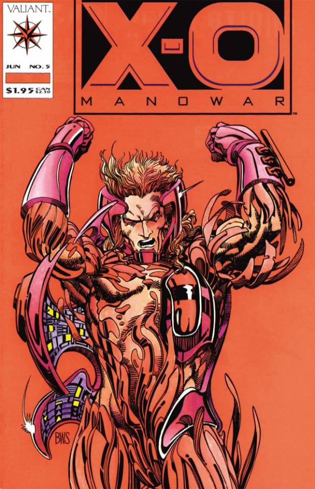
One of my favorite examples of a great cover pulling me into a comic I would have not otherwise checked out is Barry Windsor-Smith's cover for X-O Manowar #5 from the original Valiant.
I had ignored Valiant in its early days for a variety of reasons, most of which were fueled by the fact I was already buying too many comics I didn't enjoy. Much of my reading had become a habit rather than something I was doing deliberately for enjoyment. I had actually already made the decision to curtail much of my comic book reading.
So, a number of their titles and issues had come and gone from the shelves at my local comic shop, and I had quickly convinced myself that I wasn't missing anything.
Then I saw an ad featuring Barry Windsor-Smith's cover for X-O Manowar #5.
It was striking. It was simple. It was high contrast.
Calling it "high contrast" isn't ignoring the fact that it was overwhelmingly red.
No, the contrast came between the highly detailed figure of Aric in the X-O armor and the completely monochromatic background. Aric's muscles and the armor's metal were in parts indistinguishable, but there were also parts in which we saw distinct elements of man and machine. We saw defiance in his facial expression and power in his arms. This was a character not to be messed with.
At the time X-O Manowar #4 was on the stands. I picked it up. I read the issue standing at the store. An expletive or two may have been uttered when I realized I was going to collect the title.
By the time #5 finally arrived, I already had everything Valiant had put out to date.
What a ride that pre-Unity material was! Those early issues of X-O Manowar were fantastic reads.
I dropped just about all of the titles I was buying out of habit when the early Valiants reminded me of how great it felt to read and to track down really good comics. It changed my buying habits, reenergized my desire to collect, and in large part set me on my path into the comics industry.
And it might never have been, if not for the cover of X-O Manowar #5.
That's my idea of a cover that did its job.
– J.C. Vaughn

Popular Topics
Overstreet Access Quick Links
COVER STORY: X-O Manowar #5
What makes the best comic book covers? It's a great topic for debate. For us as individuals there is no wrong answer, of course. It's purely subjective. But with a little thought, it is frequently possible to explain what it is about a particular image that grabs you. The best ones are the ones that make you stop and check out something you weren't previously going to purchase – and in some cases, you even end up picking up a title you've never even heard of before.
One of my favorite examples of a great cover pulling me into a comic I would have not otherwise checked out is Barry Windsor-Smith's cover for X-O Manowar #5 from the original Valiant.
I had ignored Valiant in its early days for a variety of reasons, most of which were fueled by the fact I was already buying too many comics I didn't enjoy. Much of my reading had become a habit rather than something I was doing deliberately for enjoyment. I had actually already made the decision to curtail much of my comic book reading.
So, a number of their titles and issues had come and gone from the shelves at my local comic shop, and I had quickly convinced myself that I wasn't missing anything.
Then I saw an ad featuring Barry Windsor-Smith's cover for X-O Manowar #5.
It was striking. It was simple. It was high contrast.
Calling it "high contrast" isn't ignoring the fact that it was overwhelmingly red.
No, the contrast came between the highly detailed figure of Aric in the X-O armor and the completely monochromatic background. Aric's muscles and the armor's metal were in parts indistinguishable, but there were also parts in which we saw distinct elements of man and machine. We saw defiance in his facial expression and power in his arms. This was a character not to be messed with.
At the time X-O Manowar #4 was on the stands. I picked it up. I read the issue standing at the store. An expletive or two may have been uttered when I realized I was going to collect the title.
By the time #5 finally arrived, I already had everything Valiant had put out to date.
What a ride that pre-Unity material was! Those early issues of X-O Manowar were fantastic reads.
I dropped just about all of the titles I was buying out of habit when the early Valiants reminded me of how great it felt to read and to track down really good comics. It changed my buying habits, reenergized my desire to collect, and in large part set me on my path into the comics industry.
And it might never have been, if not for the cover of X-O Manowar #5.
That's my idea of a cover that did its job.
– J.C. Vaughn
Popular Topics
Overstreet Access Quick Links